


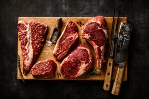
The customer is a premium beef producer with an experienced sales team servicing foodservice, retail, and export customers. Sales representatives manage a wide range of cuts, specifications, pricing rules, and inventory positions while responding quickly to customer requests.
The customer is a large beef producer managing complex supply chains from livestock intake through to sales and financial planning. Accurate forecasts of marbling scores and carcass weights are essential for pricing, customer commitments, and financial performance.
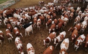
The customer is Australia’s largest integrated cattle and beef producer, supplying premium grass-fed, grain-fed, and Wagyu beef to global export markets. Their operations span backgrounding, feedlots, processing, and commercial functions, operating at significant scale with a strong focus on high-quality, data-driven production.
